
Ten portals. Zero guidance. Completely dependent on someone else.
Before SWCS, this is what a founder's journey looked like:
This wasn't just a consolidation problem. It was a cognitive load and anxiety problem. Founders approaching government compliance are often first-time founders — stressed, uncertain, and easily overwhelmed. The system needed to do more than combine 10 portals. It needed to guide, reassure, and reduce decision fatigue at every step.
Four very different people. One interconnected system.
The most complex design challenge on SWCS wasn't any single portal — it was ensuring that four very different user types could operate within the same ecosystem without friction. Each role has different goals, different technical comfort levels, and different stakes.
Approvals currently handled
Each approval type has different document requirements, processing timelines, and government bodies involved. The system needed to abstract all of this complexity from the applicant while surfacing exactly the right information to the CS and Admin at the right time.
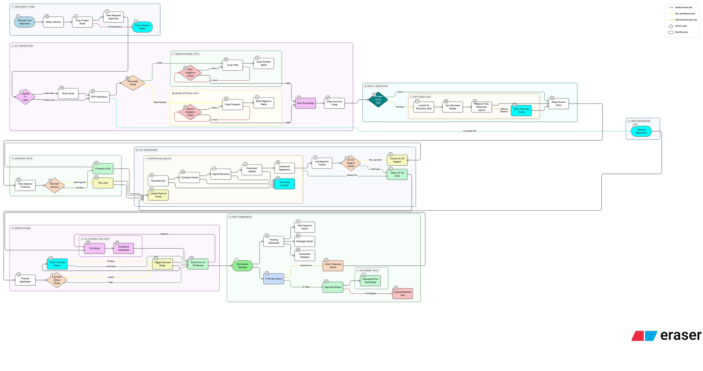
Mapping every decision point before drawing a single screen
I worked closely with the PM to understand the regulatory requirements, approval dependencies, and operational constraints before opening Figma. The IA was my primary design artefact for the first part of this project.
Information Architecture
Using Eraser.io, I mapped the full ecosystem — all four portals, every major user flow, decision points, edge cases, and the connections between user roles. This became the reference document for the PM, developers, and myself throughout the project.
Key edge cases the IA helped surface:
- What happens when a CS rejects a document — does the applicant get notified immediately or only after CS adds a note?
- What if an SLA breach occurs while an admin is on leave — who gets the escalation?
- Can an applicant switch their assigned CS mid-application?
- What approval types are conditional — i.e., only needed based on business type?
Discovery: finding what approvals you need
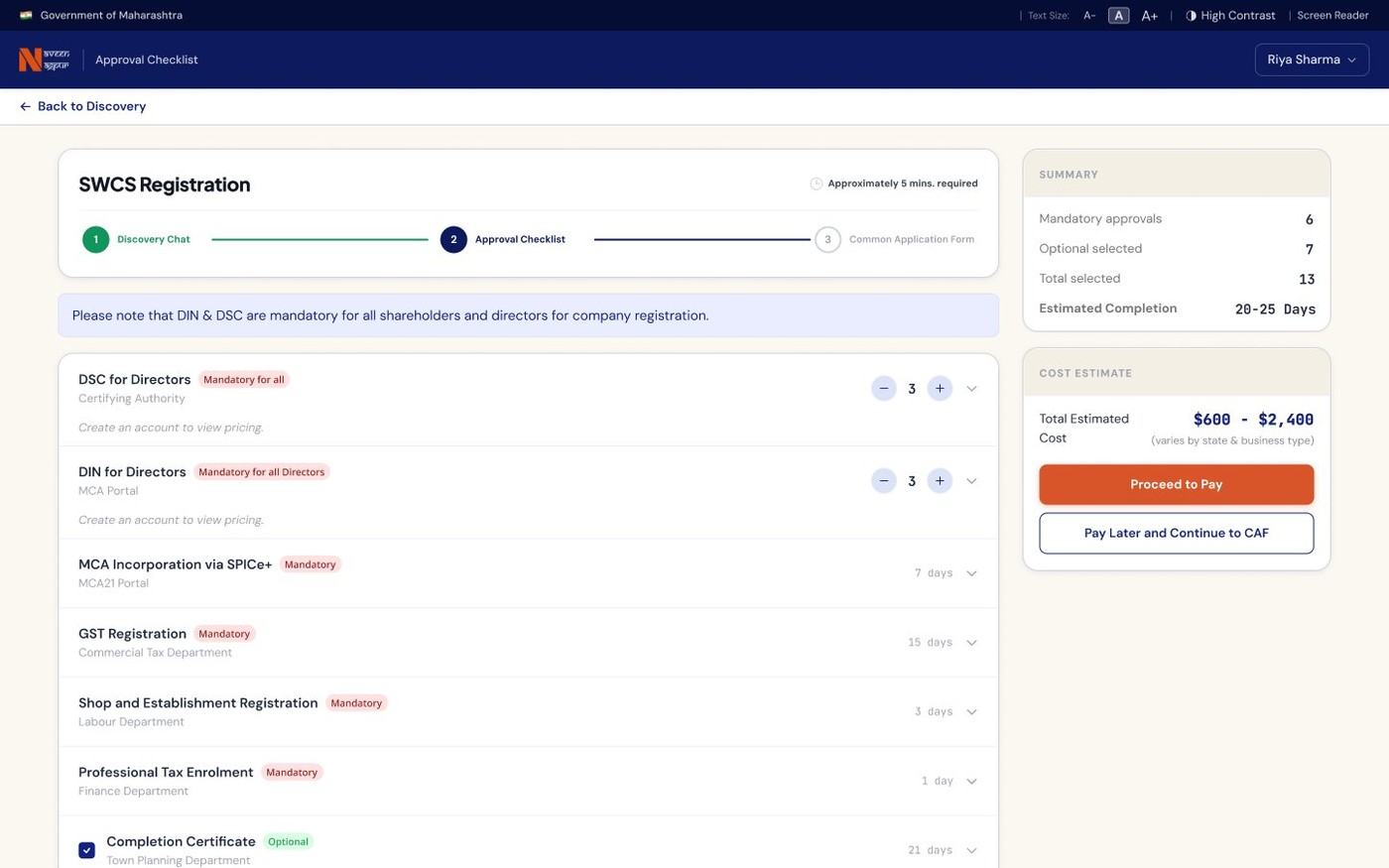
One of the first problems I needed to solve was helping founders understand what approvals they actually required — before they could even begin applying. The PM validated this as a critical gap. My solution was a guided discovery chat flow — a conversational interface that asks a founder a short series of questions (business type, structure, activities) and surfaces exactly the approvals they need, with no jargon and no overwhelm.
"The discovery chat flow and the common application form layout were particularly well received. They addressed the core anxiety of not knowing where to start."
Fewest clicks. Lowest anxiety. Every decision justified.
"Combine 10 approvals into 1 flow — without making it feel like 10 approvals."
The guiding principle throughout every design decision was: reduce cognitive load and decision fatigue for the founder. Every extra click, every ambiguous label, every unnecessary form field was a reason for a first-time founder to abandon the process or make an error.
This meant being ruthless about what we showed, when we showed it, and how we framed it.
IA and edge case mapping first
Before any screens, I mapped the full system in Eraser.io — all user roles, flows, and edge cases. This was aligned with the PM and became the reference document for the entire project. It prevented contradictions between portals later.
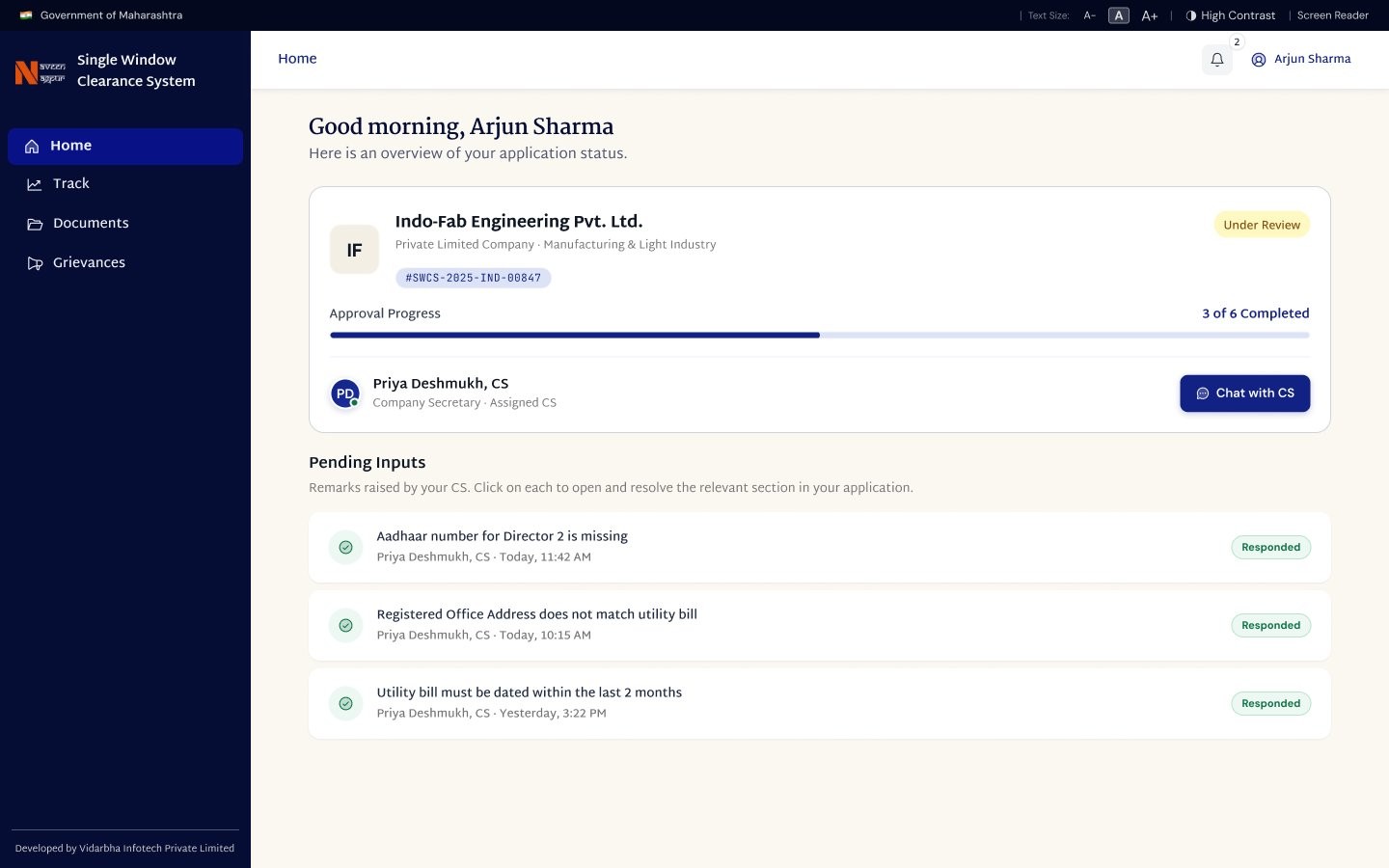
Applicant portal — guided, not gated
The discovery chat flow was the first thing I designed for the applicant. Rather than presenting a list of 10 approvals upfront, the system asks 4–5 questions and builds a personalised approval checklist. This reframes the experience from "navigate a maze" to "follow a guided path." The common application form was designed to collect shared data (company name, address, director details) once — and pre-fill it across all approval-specific forms.
CS portal — client management, not just document upload
CS users manage multiple applicants simultaneously. I designed their portal around a client list as the primary view — with inline status indicators so a CS can see at a glance which clients need attention. Document requests and applicant communication are handled within the same interface, reducing context switching.
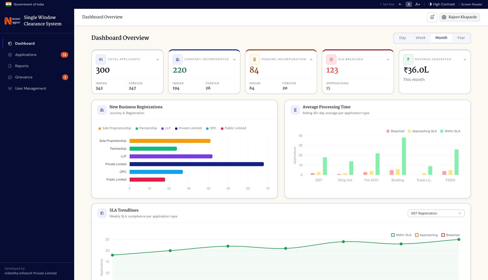
Admin portal — density without overwhelm
Admin officers need high information density — they're tracking dozens of applications across multiple approval types. I designed a filterable application tracker as the primary view, with SLA breach indicators surfaced prominently. Grievance resolution and user management are separate sections, not buried in settings.
Chairman portal — macro, not operational
The chairman doesn't manage individual applications. They need a high-level view of pipeline health, SLA compliance, and approval throughput. I designed a dashboard-first experience with summary metrics, trend charts, and escalation alerts — no operational detail unless they drill down.
Figma file — annotated for developers
Every interaction state, edge case, and decision point was annotated directly in the Figma file. Because development is happening on Claude Code, having a precise, well-documented Figma file is critical — it's the single source of truth the development team refers to.
"Show the applicant their checklist — not the approval process."
Early explorations of the applicant dashboard showed all approvals in a process-centric layout — status badges, department names, filing codes. It was accurate but overwhelming. A first-time founder looking at "Spice+ — MCA submission pending" has no idea what that means or what to do next.
I reframed the dashboard around the applicant's checklist, not the government's process taxonomy. Each approval shows a plain-language label, a clear next action, and a progress indicator. The system handles the underlying complexity invisibly.
How I used AI tools to move faster without cutting corners
This project was designed and is being built using an AI-native workflow — and that shaped how I worked throughout.
Eraser.io for IA AI-assisted
Eraser.io's diagramming tools let me rapidly map and iterate on the full ecosystem IA — including decision trees, role-based access logic, and edge cases — in a fraction of the time a manual diagramming tool would take. The IA was shared with the PM for alignment before any design work began.
ChatPRD for edge case discovery AI-assisted
I used ChatPRD to pressure-test the user flows before designing them — prompting it with user scenarios to surface edge cases I might not have considered. What happens when an applicant's GST application is rejected while other approvals are still pending? This kind of systematic edge-case thinking shaped the IA directly.
Figma Make for rapid UI exploration AI-assisted
For complex screens like the Admin dashboard and the Chairman overview, I used Figma Make to generate initial layout variants quickly — then refined and validated the most effective structure with the PM before building out the full hi-fi designs.
Built on Claude Code AI-native
Development of SWCS is happening entirely on Claude Code — making the Figma file the primary communication layer between design and development. This raised the bar for how precisely I annotated interactions, states, and edge cases in the file. Every annotation is a direct development instruction.
An AI-native development stack changes what a designer needs to deliver. With Claude Code handling implementation, the quality of the design artefact directly determines the quality of what gets built. Precise annotations, complete edge case documentation, and well-structured component logic aren't nice-to-haves — they're the handoff.
What we built. What changed.
"The discovery chat flow and common application form layout were particularly well received."
— Product Manager, Stratzi.ai
What I'd do differently
"If I had more time…"
The biggest thing missing from this project was direct user research with actual founders — people who had recently gone through the business registration process in Nagpur. The pain points I designed against were well understood from stakeholder conversations, but a round of 5 user interviews would have validated the discovery chat flow structure, the information hierarchy of the applicant dashboard, and whether plain-language approval labels actually reduce confusion for non-technical users.
I also would have liked to run a structured task analysis with a CS user before finalising their portal. The CS workflow varies significantly depending on how many clients a CS manages — a solo practitioner handles things very differently from someone managing 50+ clients. The design currently optimises for the latter, but that assumption deserves validation.
Finally, the SLA escalation system in the admin portal was designed based on requirements conversations, not observed behaviour. Watching an admin officer work through their actual day — how they prioritise, where they get stuck — would have produced a more refined escalation and notification design than what requirements alone could specify.